
Maybe you’re standing in a room right now, trying to picture it in a different color. A shade that looked perfect in a photo might feel completely wrong once it’s on your wall. Understanding how interior paint color can affect a room starts with knowing why that happens.
Most color advice jumps straight to recommending specific shades. It rarely explains why color changes how a room actually looks and feels in the first place. Some homeowners repaint a room twice before landing on something that works. No one explained the reasoning behind the choice the first time. Understanding the mechanism behind it helps you choose with confidence instead of guessing from a paint chip.
The Mechanism Behind How Interior Paint Color Affects a Room
Color changes how a room feels because different colors reflect light differently. Your eye and brain read that difference in reflected light as a change in size, brightness, or mood.
Lighter colors reflect more of the light hitting them back into the room. Darker colors absorb more of that light instead. The amount of light bouncing around a space drives most of what people perceive as a room feeling a certain way.
Color often gets treated as a purely aesthetic choice. It’s really a functional one. The same wall color can produce a different result depending on how much light it reflects. That’s true whether the room is a bright kitchen or a small bathroom with a single window.
How Color Affects Perceived Size
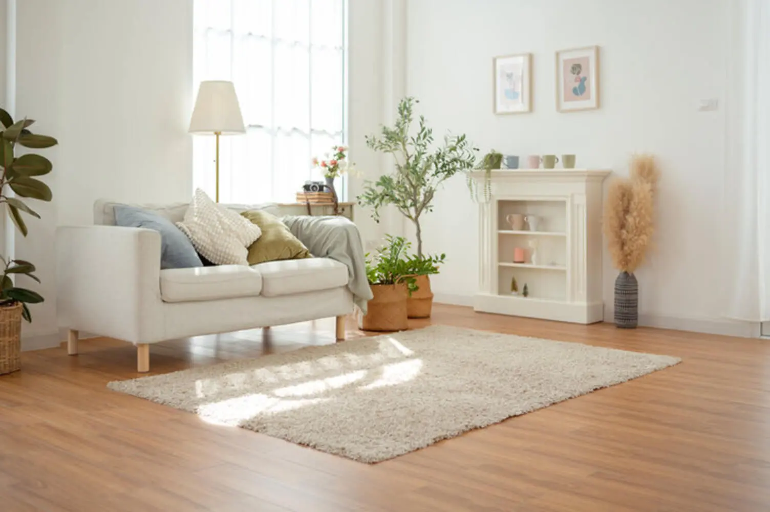
Lighter colors make a room feel larger and more open. They reflect more light and soften the visual boundary of the walls. Darker colors make a room feel smaller and more enclosed. They absorb light instead, which makes the walls feel closer.
A wall that reflects a lot of light makes it harder for your eye to locate exactly where that surface ends. That creates a sense of the room extending further than it actually does. A wall that absorbs light reads as a firmer, closer boundary instead.
This effect is strongest on the walls most visible from where you stand or sit. A hallway or narrow room shows this effect more dramatically than a wide, open room. Picture a narrow laundry room painted a deep charcoal. The walls seem to close in almost immediately. Paint that same room a soft, warm white instead, and it reads as noticeably more open. Nothing about its actual dimensions changed.
The effect works in reverse too. A large, open-concept living room can sometimes feel a little too vast or impersonal. A deeper, warmer wall color pulls the perceived boundary in slightly. That makes the space feel more grounded without shrinking it on paper.
Ceilings play into this same effect, and they’re easy to overlook. A ceiling painted the same white as the walls tends to disappear from view. That can make a room feel taller. A ceiling painted a shade darker than the walls pulls that boundary down instead, which can make a tall room feel cozier. Homeowners spend a lot of time on wall color and very little on the ceiling above it. It works through the exact same principle. Ceiling color matters more than most homeowners assume. It’s worth thinking through alongside the walls rather than defaulting to flat white every time.
How Color Affects Mood and Atmosphere
Cooler, lighter colors tend to create a calm, airy feeling. Warmer, darker colors tend to create a cozy, intimate feeling. This is a direct extension of the same light-reflectance principle, not a separate effect.
A brighter, more light-filled room tends to read as energizing or fresh. A room with more absorbed light and deeper shadow reads as relaxed or grounded. That’s why size and mood stay closely linked, not separate effects.
Mood discussions often stick purely to color psychology, like blue meaning calm or red meaning energy. But how much light a color reflects into the space drives a lot of that emotional response too. A room meant for winding down benefits from colors that soften and absorb light. A room meant for activity benefits from brighter colors instead.
Take a home office as an example. A soft, muted green or blue reflects a moderate amount of light. That keeps the room feeling alert without the higher energy of a brighter, warmer tone. A warmer tone might feel better suited to a dining room instead, where conversation and activity are the goal.
A primary bedroom shows this same principle from the other direction. Homeowners often default to a crisp white for a simple look. A softer, more muted color that absorbs a bit more light usually creates a more restful feeling once the sun goes down. Lamps take over as the main light source at that point, and the room stops relying on daylight to feel finished.
How Natural Light Changes the Outcome
The natural light a room already gets changes how any color will actually read once it’s on the wall. That’s why the same color can look different in two different rooms.
Florida homes often get abundant natural light. That gives a color more ambient light to reflect or absorb, which makes the effects above more pronounced. A room with limited natural light gives a color less to work with. Darker colors can feel heavier there, and lighter colors can feel washed out.
The direction a room faces changes the color of the natural light itself:
- North-facing rooms tend to get cooler, bluer light
- South-facing rooms tend to get warmer light
- East-facing rooms shift from cool morning light to warmer afternoon tones
- West-facing rooms tend to hold warm light later into the day
That shift changes how a paint color’s undertones show up on your walls. A color that looks perfect in a well-lit, south-facing room might look flat in a room with cooler light. Testing a color in the actual room matters more than trusting how it looks somewhere else.
This is also why a small sample painted directly on the wall works better than a swatch under one light source. A color can look cool and crisp in the morning. It can shift noticeably warmer by late afternoon as the sunlight changes.
Furniture and window coverings in a room matter too. Heavy curtains or a lot of dark furniture absorb light before it reaches the walls. That changes how much a color has to work with in the first place. Sheer curtains and lighter furniture let more ambient light circulate instead. That can make even a moderately dark wall color read brighter than expected.
Choosing Color Based on a Room’s Purpose and Light
The right color for a room comes from what the room is used for and how much natural light it gets. Picking a color in isolation skips the part that determines how it will actually perform.
A kitchen or living room, meant to feel spacious and energizing, benefits from leaning into the effects covered earlier. In Florida’s climate, specific cool-toned options work especially well, since natural light stays abundant most of the year. A bedroom, meant to feel restful, can lean into the coziness effects instead.
Many homeowners choose a color first and hope it works. Starting with the room’s function and light instead leads to a better result. Color isn’t the only factor either. Sheen level affects how light bounces off a surface too. Choosing the right paint finish plays its own role in how a room reads.
An accent wall is one common way homeowners try these principles without repainting an entire room. A single darker wall can add the cozy feeling described earlier. The rest of the room stays light and open. This works especially well in a bedroom or dining room, where you want a mix of both effects in the same space.
A small home gym or bonus room is another good test case. These rooms often get repurposed more than once over the years. A color that stays flexible across different uses tends to hold up better than one chosen for a single specific purpose.
Thinking through purpose and light before choosing a color gets you a result that actually functions the way you want day to day. It won’t just look good on a paint chip.
Why Color Choice Is a Functional Decision, Not Just a Preference
Paint color changes a room through a real, physical mechanism: light reflectance. That mechanism shapes both how spacious a room feels and how it feels to spend time in.
Choosing a color without considering a room’s light and purpose is a common reason a repaint doesn’t turn out the way you pictured it. Getting color guidance suited to your specific room helps you avoid that outcome.
Our interior painting professionals in Melbourne can walk you through color choices that fit your space. Contact us today for a quote, and let’s find the right color for your room.