Choosing the right interior paint colors for commercial spaces can transform an environment, influencing mood and productivity. Whether it’s a bustling office, a cozy café, or a chic retail store, color plays a pivotal role in defining the ambiance and brand identity. The subtle power of hues can evoke emotions, inspire creativity, or even encourage relaxation.
For businesses looking to make an impact with their interiors, understanding how different colors affect various types of commercial spaces is essential. With strategic color choices, companies can create inviting environments that leave lasting impressions on clients and employees alike.
Key Takeaways
- Importance of Color Choices: Selecting the right interior paint colors in commercial spaces significantly impacts mood, productivity, and brand identity, making them a crucial element for businesses aiming to enhance their environment.
- Retail Spaces: Bright colors like yellows and oranges energize retail environments, encouraging purchases, while neutral tones such as grays and beiges provide a sophisticated backdrop that highlights merchandise.
- Office Environments: Calming blues and greens promote focus and reduce stress in offices, whereas energizing yellows and oranges foster creativity and collaboration among employees.
- Restaurants: Warm reds and terracottas stimulate appetite and conversation in dining areas. Neutral whites and grays create an elegant ambiance suitable for upscale restaurant settings.
- Healthcare Facilities: Soft pastels offer a calming effect for patients, reducing stress levels, while clean white shades emphasize hygiene essential for maintaining sterile healthcare environments.
- Educational Institutions: Primary colors invigorate learning spaces by stimulating student engagement, whereas relaxed neutrals create focused atmospheres ideal for study zones.
Importance Of Choosing The Right Interior Paint Colors
When it comes to commercial painting, selecting the right interior paint colors for commercial spaces is crucial. A well-chosen palette enhances the ambiance and functionality, impacting both employees and clients. Colors influence psychological responses; calming hues like blues can reduce stress in office environments, while vibrant shades such as reds boost energy in retail or dining areas. Inappropriate color choices might lead to discomfort or reduced productivity.
Strategically chosen colors align with a company’s brand identity, reinforcing its message and values. In commercial spaces where first impressions matter, an inviting aesthetic creates positive client experiences and employee satisfaction. Professional painting companies possess the expertise to guide businesses in selecting colors that not only meet functional needs but also reflect corporate branding effectively.
Retail Spaces
Retail spaces benefit from strategic color choices that enhance customer experience and drive sales. Effective use of color can create a dynamic, inviting environment that aligns with brand identity.
Bright And Inviting Colors
Bright colors like yellows and oranges energize retail spaces by attracting attention and encouraging purchases. These hues stimulate excitement, making them ideal for stores aiming to create lively atmospheres. Professional painting companies recommend combining bright accents with neutral tones to balance vibrancy and maintain visual comfort.
Neutral Tones For Sophistication
Neutral tones such as grays, beiges, and soft whites offer sophistication in upscale retail environments. They provide a timeless backdrop that highlights products without overwhelming the senses. Experts in commercial painting suggest using neutrals strategically to create elegant settings that allow merchandise to stand out while maintaining an air of refinement.
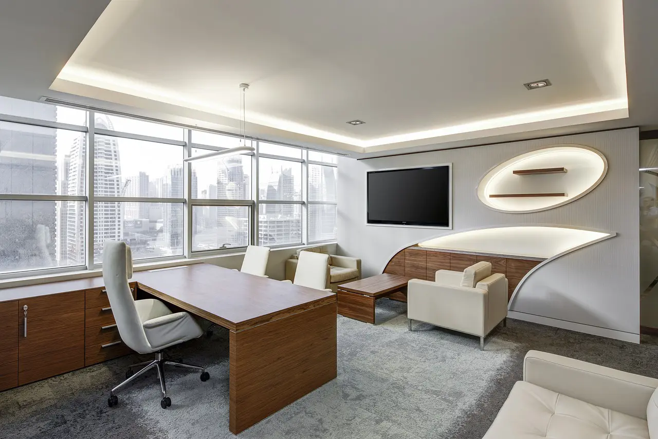
Offices
Color choices in office environments play a crucial role in influencing employee productivity and creating an inviting atmosphere. Selecting the right hues can transform commercial spaces into efficient work hubs.
Calming Blues And Greens
Blues and greens are ideal for offices, promoting calmness and focus. Blue tones help reduce stress and create a serene environment, making them suitable for high-pressure areas like conference rooms. Green shades enhance concentration and bring a sense of balance, perfect for spaces where creativity thrives.
Energizing Yellows And Oranges
Yellows and oranges inject energy into office settings, fostering creativity and collaboration. Yellow accents brighten spaces without overwhelming them, ideal for brainstorming areas or break rooms. Orange adds warmth and enthusiasm to communal zones, encouraging interaction among employees while maintaining a professional ambiance.
Restaurants
In restaurants, color choice and color types influence ambiance and customer experience. Warm tones create inviting atmospheres enhancing dining pleasure.
Warm Reds And Terracottas
Warm reds and terracottas add vibrancy to restaurant interiors. These colors stimulate appetite and conversation, making them ideal for dining areas. Professional painting companies recommend balancing these hues with softer accents in commercial spaces, ensuring they don’t overwhelm diners.
Elegant Whites And Grays
Elegant whites and grays provide a sophisticated backdrop in upscale restaurants. These neutral tones enhance lighting effects, creating a sense of space without distraction. Experts suggest using these shades in commercial spaces to highlight architectural details and maintain a clean aesthetic that complements varied decor styles.
Healthcare Facilities
Selecting appropriate interior paint colors in healthcare facilities plays a vital role in promoting patient well-being and creating a soothing environment. Professional painting companies provide insights into how color choices can enhance comfort and functionality.
Soft Pastels For Calmness
Soft pastel colors like light blues, greens, and pinks create a calming atmosphere in healthcare settings. These hues reduce stress and anxiety for patients and visitors alike. Painting experts recommend pastels to soften harsh lighting and design elements, fostering tranquility in waiting areas and patient rooms.
Clean Whites For Hygiene
Clean white shades convey hygiene and cleanliness, essential characteristics for healthcare environments. White walls reflect light effectively, enhancing visibility while maintaining sterile conditions. Professionals suggest using whites alongside soft accents to prevent starkness, ensuring spaces feel both safe and welcoming for all users.
Educational Institutions
Educational institutions benefit from carefully chosen interior paint colors that promote learning and well-being. Selecting the right hues enhances both focus and creativity, crucial for educational environments.
Stimulating Primary Colors
Primary colors like red, blue, and yellow invigorate classrooms by stimulating students’ minds. Red energizes activities in play areas, while blue encourages calmness during exams. Yellow boosts concentration and positivity, making it ideal for collaborative spaces.
Relaxed Neutrals For Focus
Neutral tones such as soft beiges and light grays create a serene atmosphere conducive to learning. These shades reduce distractions in study zones and libraries, helping students maintain focus. Professional painting companies recommend these palettes to foster productivity while ensuring comfort in educational settings.
Choose Marsh Paint Co. for Commercial Painting Services in Melbourne, FL
Marsh Paint Co. stands out as a leader in commercial painting services throughout Melbourne, FL. Specializing in transforming various commercial spaces, we offer expert guidance on selecting the perfect color palettes that align with business objectives and brand identity.
With Marsh Paint Co.’s comprehensive painting solutions, businesses can ensure their interiors become strategic assets that support long-term goals while creating inviting atmospheres for clients and employees alike.