Interior painting trends shaping homes in 2026 are already pretty clear as we kick off the year: warmer tones, richer colors, and more intentional paint choices that make a space feel finished—not “trendy for the sake of it.”
If you’ve been thinking about repainting, you’re probably trying to strike that balance. You want your home to feel current, but you don’t want to commit to something that feels dated or overwhelming by the time the year’s half over.
This guide covers the biggest paint directions showing up right now in January 2026, including the color shifts homeowners are leaning into and the ways paint is being used beyond the usual neutral-only approach. You’ll also see simple, low-risk ways to try these ideas in a real home without going all-in everywhere.
Bring Back Warm Neutrals (Because Cool Gray Is Fading Out)
One of the biggest shifts in 2026 is how quickly cool gray is losing momentum. Homeowners are still choosing Bring Back Warm Neutrals (Because Cool Gray Is Fading Out)
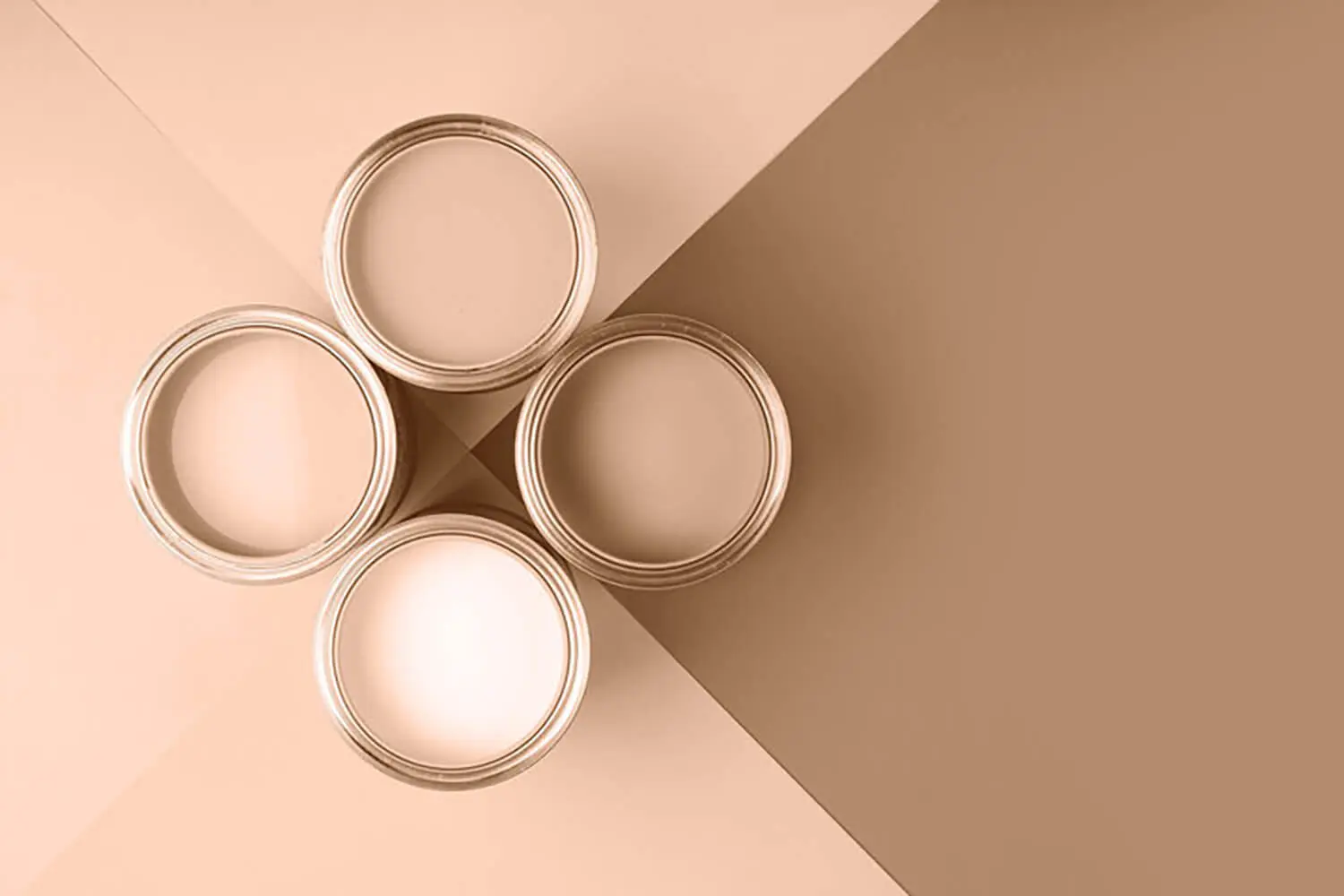
One of the biggest shifts in 2026 is how quickly cool gray is losing momentum. Homeowners are still choosing neutral walls, but the “default neutral” is changing.
Instead of crisp gray undertones, interiors are leaning warmer and softer again. The goal is a space that feels clean, but not sterile.
Warm neutrals in real homes tend to look like:
- Warm whites that feel creamy instead of sharp
- Off-whites that add softness without looking yellow
- Beige and greige that reads more “sand” than “gray”
- Clay-adjacent neutrals that feel grounded and natural
You’ll see the same warm shift in the kitchen palette trends highlighted by Better Homes & Gardens, where soft, inviting neutrals are showing up everywhere.”
This palette works with a lot of styles without feeling like a statement. It pairs easily with wood tones, softer metals, and natural textures that make a home feel more lived-in.
And it’s not just designers saying this—NKBA’s 2026 color direction is pointing the same way: warmer neutrals are becoming the new safe choice.”
Homeowners like this direction because it feels calmer and cozier—and for many Sebastian homeowners, understanding the reasons to hire a house painter in Sebastian, FL helps ensure those warmer tones actually hold up long-term in a coastal climate. It also tends to look more inviting than gray-heavy interiors, especially in spaces like living rooms and bedrooms where comfort matters.
The Kitchn’s 2026 trend coverage also points to warmer, softer neutrals replacing the cooler gray tones that dominated the last decade.
If your house still has cool gray walls, this doesn’t mean you need to repaint everything. But if you want a more current look for 2026, shifting your neutrals warmer is one of the easiest updates you can make without going bold.
Try Color Drenching When You Want Something Bold but Clean
Color drenching is one of those 2026 paint trends that looks high-end, but the idea behind it is actually pretty simple. It means using one color across the walls and trim (and sometimes the ceiling) so the whole room feels wrapped in the same tone.
It’s showing up more this year because it instantly makes a space feel intentional. Instead of a room looking like “white walls with a pop of color,” it feels more finished and pulled together.
It’s also one of those looks that keeps coming up in 2026 home trends, especially when people want something bold that still feels clean.
This trend works especially well in rooms where you want a little drama without bringing in a lot of decor, like:
- Powder rooms
- Home offices
- Dining rooms
- Bedrooms (especially if you like a moodier look)
The best part is that even though it’s bold, it can still feel clean. Your eye isn’t bouncing between contrast lines and multiple colors, so the room ends up looking calmer than you’d expect.
If you’re curious but not ready to commit, start with a smaller space first. It’s a low-risk way to see how color drenching looks in real life before you bring it into bigger rooms.
Paint With Brown Again (It’s Back, and It Doesn’t Feel Dated This Time)
Brown is officially back in 2026, and it’s not the muddy, heavy brown people associate with older homes. The new version feels richer, warmer, and more intentional—like a deep neutral instead of a leftover color choice.
You’ll see tones like chocolate, espresso, and soft cocoa showing up in ways that feel grounded and elevated, especially compared to harsh black accents or cold grays.
The reason this trend works is because brown adds depth without feeling flashy. It brings warmth into a space, and it pairs easily with finishes and materials people already love right now—wood tones, creamy whites, warm metals, and natural textures.
If painting an entire room brown feels like too much, you don’t have to go all-in to get the effect.
Easy ways to use brown without darkening the whole house:
- A home office where you want it to feel cozy and focused
- Built-ins or shelving to add contrast without repainting everything
- A small enclosed room that can handle a deeper tone
- Pairing brown with warm neutrals and soft greens to keep it balanced
When it’s used intentionally, brown feels less like a “dark color” and more like a sophisticated neutral that makes the rest of the room look more finished.
Go Deeper With Color (Instead of Playing It Safe Everywhere)
Another big trend in 2026 is homeowners feeling more confident using deeper, richer colors throughout the home—not just on one accent wall.
This doesn’t mean every room is suddenly dark and dramatic. It just means people are moving away from the idea that every space has to stay light and neutral to feel “safe.”
Deeper colors are showing up in places like:
- Dining rooms that feel more cozy and intentional
- Bedrooms that feel calmer and more restful
- Entryways that feel more designed the second you walk in
- Hallways or nooks that used to be forgotten spaces
The reason this works is because deeper tones can make a room feel finished without changing the layout or adding a bunch of decor. A richer wall color instantly adds mood and depth.
And the best part is you don’t have to commit to the whole house. A few well-chosen rooms can change the feel of the entire home, while the rest stays lighter and more neutral.
If you want to try this trend without feeling overwhelmed, pick one space that feels a little “flat” right now. Deeper color is often the easiest way to add personality without making the home feel busy.
Pull From Nature-Inspired Greens (Not Just Sage)
Green has been popular for a while, but in 2026 it’s shifting into deeper, more natural tones. Sage still shows up, but it’s not the only option anymore—and honestly, it’s starting to feel a little overdone in some homes.
The greens trending this year feel more grounded and organic. Think tones that look like they belong outside, not colors that feel overly soft or washed out.
The reason green keeps working is because it reads calm without being boring. It adds color, but it still feels timeless in a way that a lot of brighter shades don’t.
You’ll see these nature-inspired greens used most in:
- Kitchens (especially on walls or cabinets for a softer statement)
- Bathrooms where the space needs to feel clean but not sterile
- Bedrooms for a relaxed, grounded feel
- Built-ins and shelving to add depth without repainting everything
Green also plays well with the warmer neutral shift happening across the rest of the home. Pair it with creamy whites, natural woods, or warm beige tones, and it feels balanced instead of trendy.
If you want color that feels safe but not boring, green is still one of the easiest choices to live with—especially when you lean into deeper, earthy tones instead of the usual pale sage look.
Use Soft Blues as Your “Quiet Color”
If you like the idea of color but you don’t want anything loud, soft blue is having a moment in 2026 for exactly that reason. It gives a room a little personality while still feeling clean, calm, and easy to live with.
The key is choosing a blue that feels muted and gentle, not bright or icy. The best versions of this trend feel almost neutral, especially when they’re paired with warm whites and natural textures.
Homeowners like soft blue because it brings a relaxed feel without making the room look “themed.” It works especially well when you want the space to feel lighter, fresher, and more restful.
Soft blues tend to work best in:
- Bedrooms
- Bathrooms
- Guest rooms
- Nurseries
They’re also a great option if your home already has warm neutrals but you want one room to feel slightly different. It’s a low-risk way to bring in color without going bold.
If you’re nervous about picking the wrong shade, start with a room that gets good natural light. Soft blues usually look their best when the room doesn’t feel dark or shadowy, because the color reads airy instead of flat.
Bring In Unexpected Pops (If Your Home Still Feels Too Beige)
Even with the return of warm neutrals, a lot of homeowners are realizing something in 2026: their homes feel calm… but maybe a little too calm.
That’s why we’re seeing more “pops” of unexpected color showing up again. Not in a chaotic way, but in small, intentional doses that make the home feel more personal.
Some of the bolder tones getting attention this year include:
- Persimmon and warm orange-based shades
- Plum and deeper berry tones
- Punchier greens that feel bright but still grounded
The key is using these colors in places that feel fun, not risky. You don’t need to paint your entire living room a bold color to get the effect.
Easy ways to try this without regretting it:
- Paint a small room, like a powder bath or laundry room
- Use it on built-ins or the back of shelving
- Try it on interior doors for a bold detail
- Highlight one architectural feature (like an entry nook or trim detail)
This trend works best when the rest of the home stays simple. Think of it like adding personality in the “details,” instead of trying to make every room a statement at the same time.
Make Finish Matter (Because Flat Walls Aren’t Always the Answer)
In 2026, it’s not just what color you choose—it’s how the paint actually looks once it’s on the wall. And a lot of that comes down to finish.
When people start using richer colors or painting more of the room (like trim and doors), the finish becomes way more noticeable. A beautiful color can still look “off” if the sheen doesn’t match the space.
Paint finish affects things like:
- How much light reflects off the wall
- Whether the color looks soft or sharp
- How visible imperfections are
- How well the surface holds up to cleaning
This is where flat paint isn’t always the best default. Flat walls can look smooth and modern, but they can also scuff easily in busy areas and show marks faster if the wall gets touched a lot.
Finish matters most in rooms like:
- Hallways and entryways
- Kitchens
- Bathrooms
- Any high-touch areas (around light switches, doors, and corners)
The practical takeaway is simple: the wrong sheen can make even a great color feel disappointing once it’s on the wall.
If you want a space to look clean and hold up long-term, finish is one of those small decisions that makes a bigger difference than most homeowners expect.
Steal Ideas From “Colors of the Year” Without Repainting Everything
Every year, “Color of the Year” lists come out and suddenly it feels like everyone is talking about the same handful of shades. And while you don’t need to copy any of them exactly, these lists can be useful for one reason: they show where design is headed.
In 2026, the common theme is pretty clear. Colors are warmer, deeper, and more personal—less icy, less sterile, and less afraid of mood.
The easiest way to use these ideas without committing your whole house is to treat them like inspiration, not a rulebook.
A simple approach that works in real homes:
- Keep main living areas neutral and flexible
- Try trend colors in smaller rooms where you can have more fun
- Use bolder shades on details like doors, built-ins, or accent areas
This avoids the most common mistake: going bold everywhere and getting tired of it fast.
If you want your home to feel updated without feeling like you’re “redoing everything,” this is one of the smartest ways to do it. You borrow the direction, not the full commitment, and your home still feels like you.
Wrap-Up: The 2026 Trend Is Warmer, Bolder, and More Personal
Interior paint in 2026 is moving in a clear direction: warmer neutrals, richer color, and a more confident use of paint throughout the home. Instead of everything staying light and “safe,” more homes are mixing calm backdrops with deeper tones that add depth and personality.
The best part is you don’t have to follow every trend to get the benefit. Even one small shift—like warming up your neutrals, adding a deeper color in one room, or choosing a finish that holds up better—can make a home feel more updated and intentional.
At the end of the day, the best trend is the one that works with your home’s light, layout, and how you actually live in it.
If you’re ready to refresh your interior this year, Marsh Paint Co. can help you choose colors and finishes that fit your style and look great long-term. Reach out to schedule an interior painting consultation and get a plan that feels current without feeling overdone.